The Overview
While employed as a graphic designer with Hartsfield-Jackson Atlanta International Airport’s Public Affairs department, I was part of a team that updated the visual Airport brand. This was important because, at the time, the Airport logo had been used inconsistently, the red and black colors mainly used in marketing materials needed an overhaul, and there were no brand guidelines established.
My Solution
-
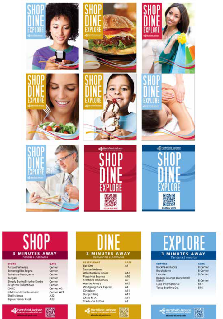
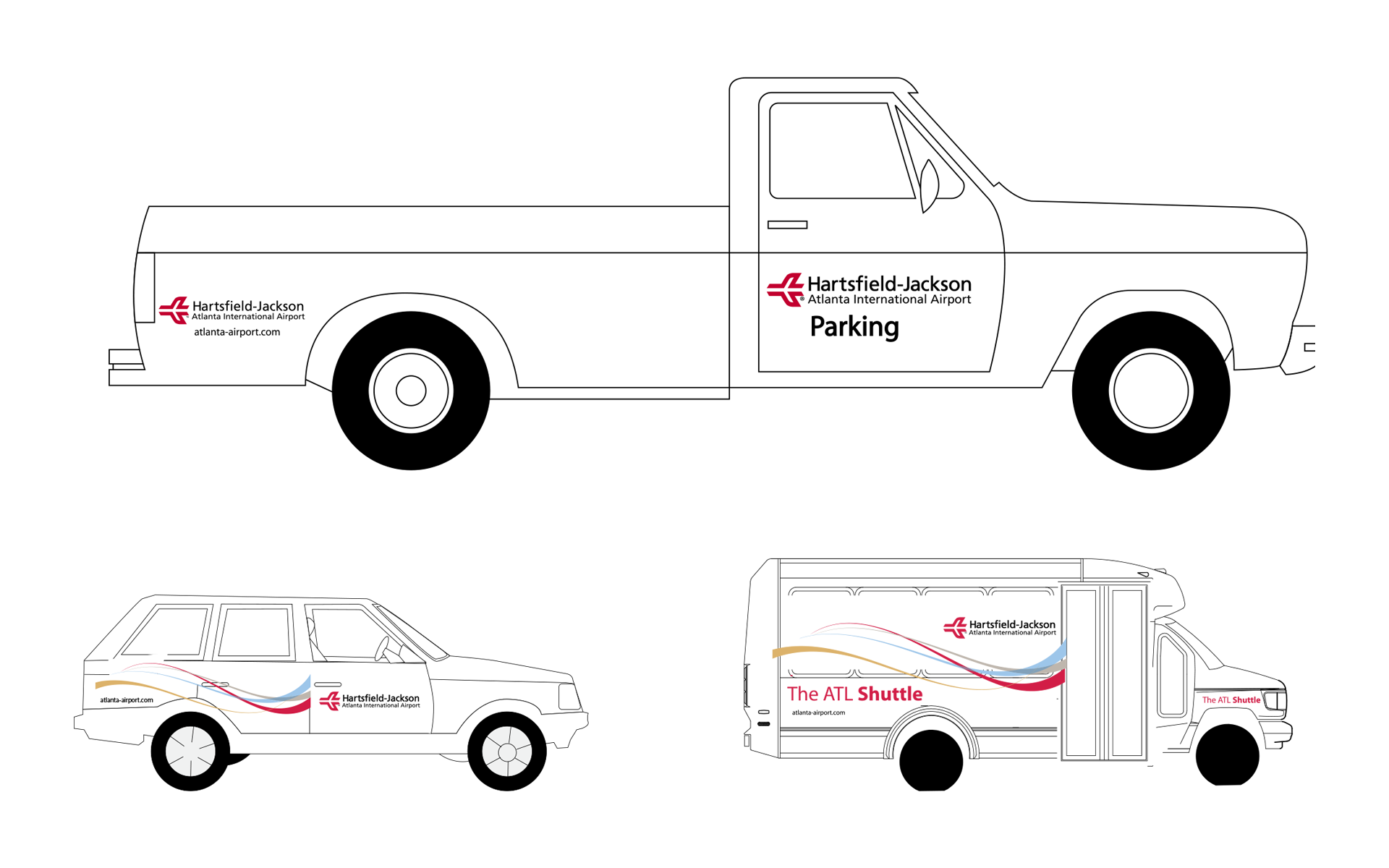
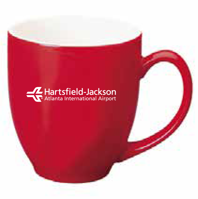
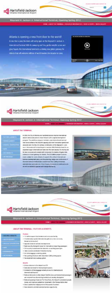
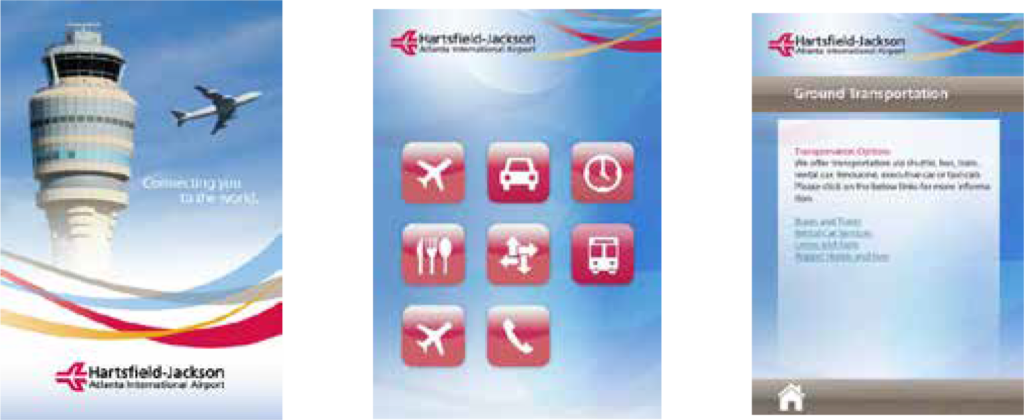
Update the Airport logo’s font and create a “lockup” so that the new logo could only be used, mainly, in one way.
-
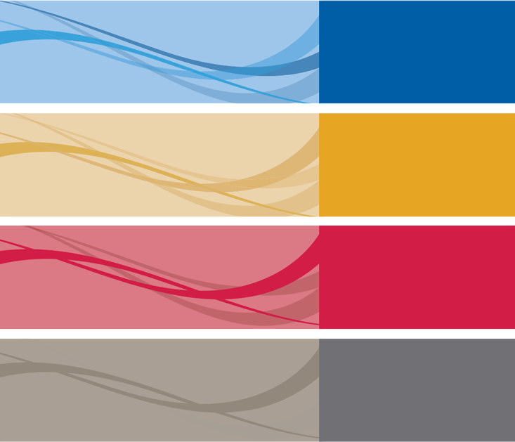
Create a color system that is brighter, modern and works with the red airplane logo.
-
Define a main, brand font to be used consistently.
-
Create a style element to use within the brand (the color “wave”.)
-
Create a brand style guide to document information.