The Overview
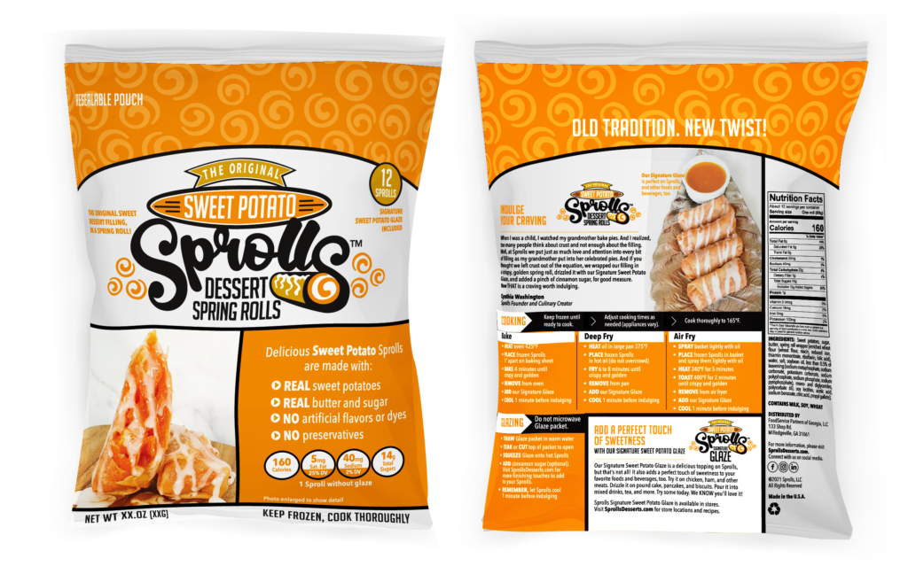
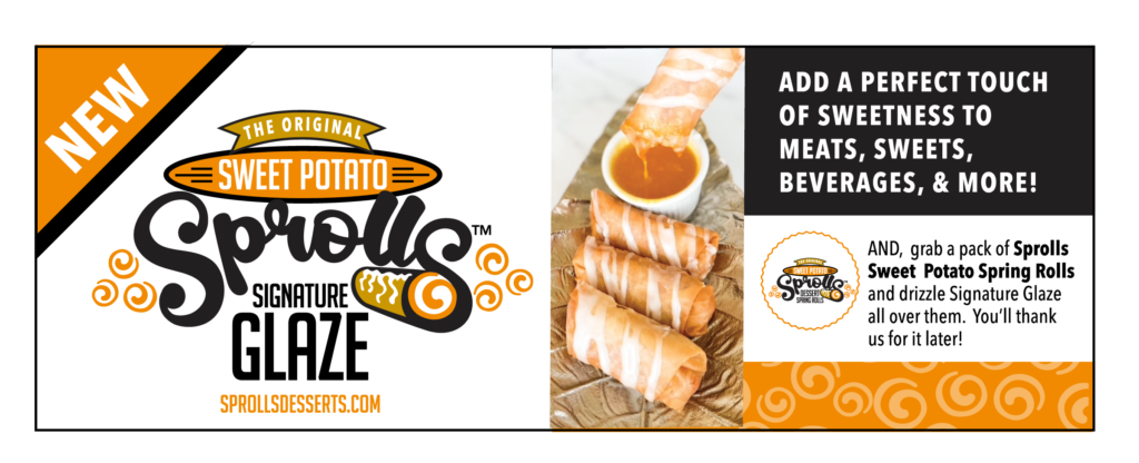
I was invited to design packaging for a product called Sprolls. Sprolls are dessert-filled, fried spring rolls topped with a sweet glaze. They had been sold successfully at local festivals for years.
The client had an opportunity to present Sprolls to a major retailer. I was asked to design just the product packaging — however, I soon realized that more would be needed. The current website colors were pink, blue and black which didn’t communicate the right tone for the product. Two different logos were used in marketing materials. Also, I felt that a branded system of logos and colors for the different product flavors would be important.
Original Logos
My Solution
-
Create a logo (based on one of the existing logos) and establish a brand look and feel.
-
Develop a hierarchy to define the corporate brand and the sub-brand of different product flavors.
-
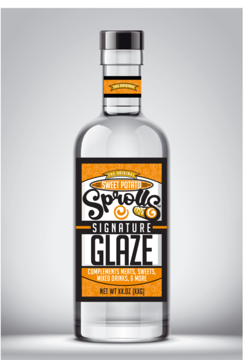
Create packaging for the first product roll-out: Sweet Potato Sprolls and Glaze.
-
Update the website and other marketing and social media graphics.
-
Find writers to develop and write the narrative, edit copy, and craft the script for the PowerPoint presentation.
Branding

Packaging
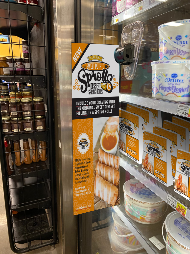
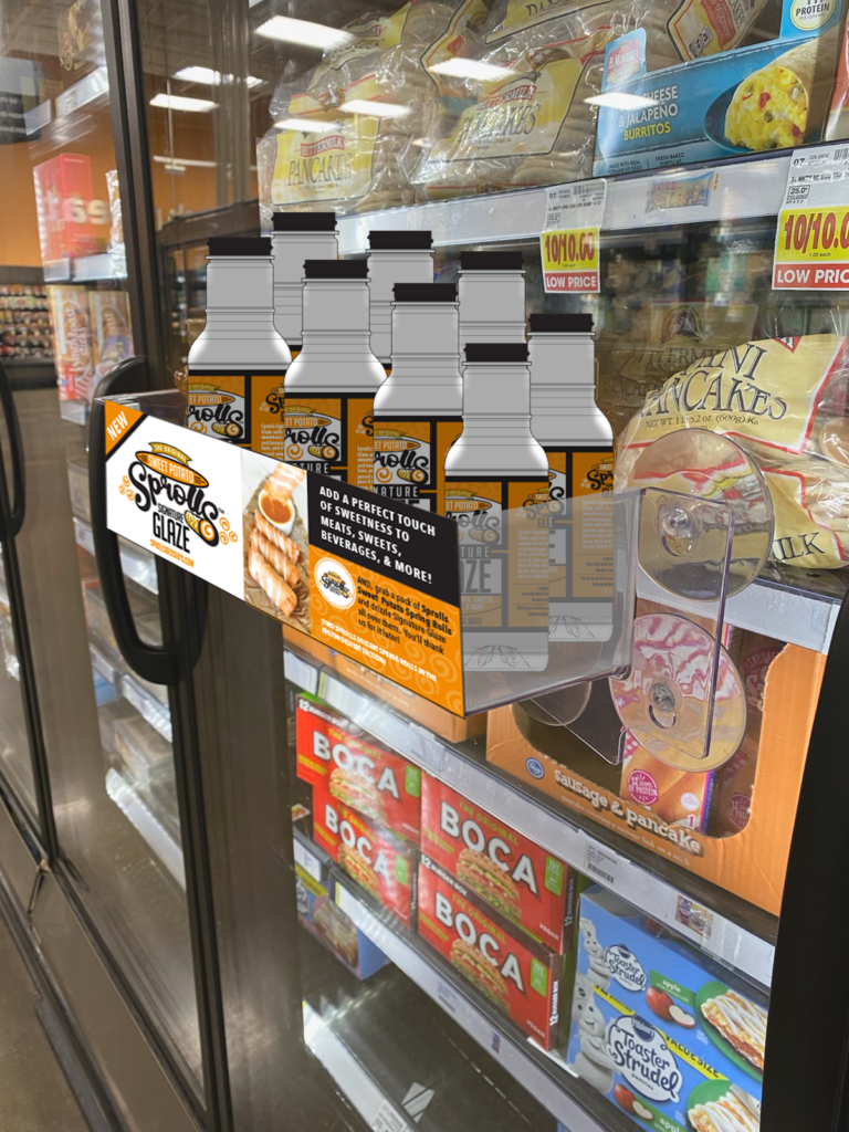
Marketing mockups
Website